
Want to learn more about data visualization with Python? Read our interview to Dr. Martin Jones.
Posted on 10 January, 2017 by Carlo Pecoraro
Data visualization is an important part of being able to explore data and communicate results. Many new Python data visualization libraries have been created in the past few years, such as pandas, vispy, matplotlib, seaborn, pygal, etc., to make data visualization more easier and powerful.
Here Dr. Martin Jones introduces us to Data Visualization with the different Python libraries.
Martin is the instructor of our “Data manipulation and visualization with Python” Workshop in Berlin (13- 17 March 2017): https://www.physalia-courses.org/courses/course10/
Hi Martin, could you introduce us the main differences among those libraries?
The first distinction we have to make is between libraries that are mainly concerned with data manipulation, and those concerned with data visualisation.
Pandas is predominantly a data manipulation library; most of the functionality concentrates on sorting, filtering, cleaning and transforming data. The reason that pandas often appears in lists of
libraries for data visualisation is that it's nearly always necessary to manipulate data in some way before we can create a visualisation. Pandas is useful for all sorts of data manipulation
tasks, from very simple things like dealing with missing data to tricky things like reshaping multidimensional data and resampling time series data. We can also use pandas to create simple
charts, but that's not its main purpose.
The rest of the libraries on the list are all concerned with visualisation, but are all designed for slightly different jobs. Let's start with the most well-known library: matplotlib is a general
purpose plotting library which has been around for a long time. It's a fairly low level library — what that means is that it gives us a great deal of control over our plots, and allows us to make
all sorts of exotic chart types, but requires a fair amount of code to do so. It's got built in functions for creating common chart types, but also allows us to draw directly with primitive
shapes (circles, lines etc.) so we can use it to create completely novel types of visualisation. It also has support for making animations. Many other tools rely on matplotlib; for example, both
pandas and seaborn actually use matplotlib internally to draw their charts.
We now come to the other visualisation libraries that are designed to tackle specific types of problems. First up is vispy, which is targeted at people who need to visualise very large datasets.
To that end, vispy is designed to take advantage of modern graphics cards. A glance at the gallery page will illustrate how it's different from matplotlib: you'll see examples taken mainly from
mathematics and physics, and no conventional charts. This is probably the library that's least likely to be useful in biology.
Pygal has two specific aims: to create charts in scalable vector graphics (SVG) format, and to have a very simple interface. SVG graphics have several nice properties: we can edit them easily
with other tools (I'm fond of Inkscape), we can scale them up to any size without blur (so they're great for posters) and we can add cool interactive features like tooltips. In terms of the
interface, pygal is kind of the opposite of matplotlib in that it's a high level charting library — it makes it very easy to draw a plot, but makes it harder to have complete control over the way
it looks or to make custom graphics.
Finally, seaborn describes itself as being for "statistical data visualisation". What this actually means is that it's very good at looking at distributions of things and relationships between
values, which encompasses a lot of what we want to do in biology! Seaborn also places an emphasis on good visualisation practise, meaning that styles are very clear and colour schemes are easy to
interpret. Like pygal, it's a high level library, but it also makes it easy to work directly with the underlying matplotlib objects when we need more control. It also has really nice
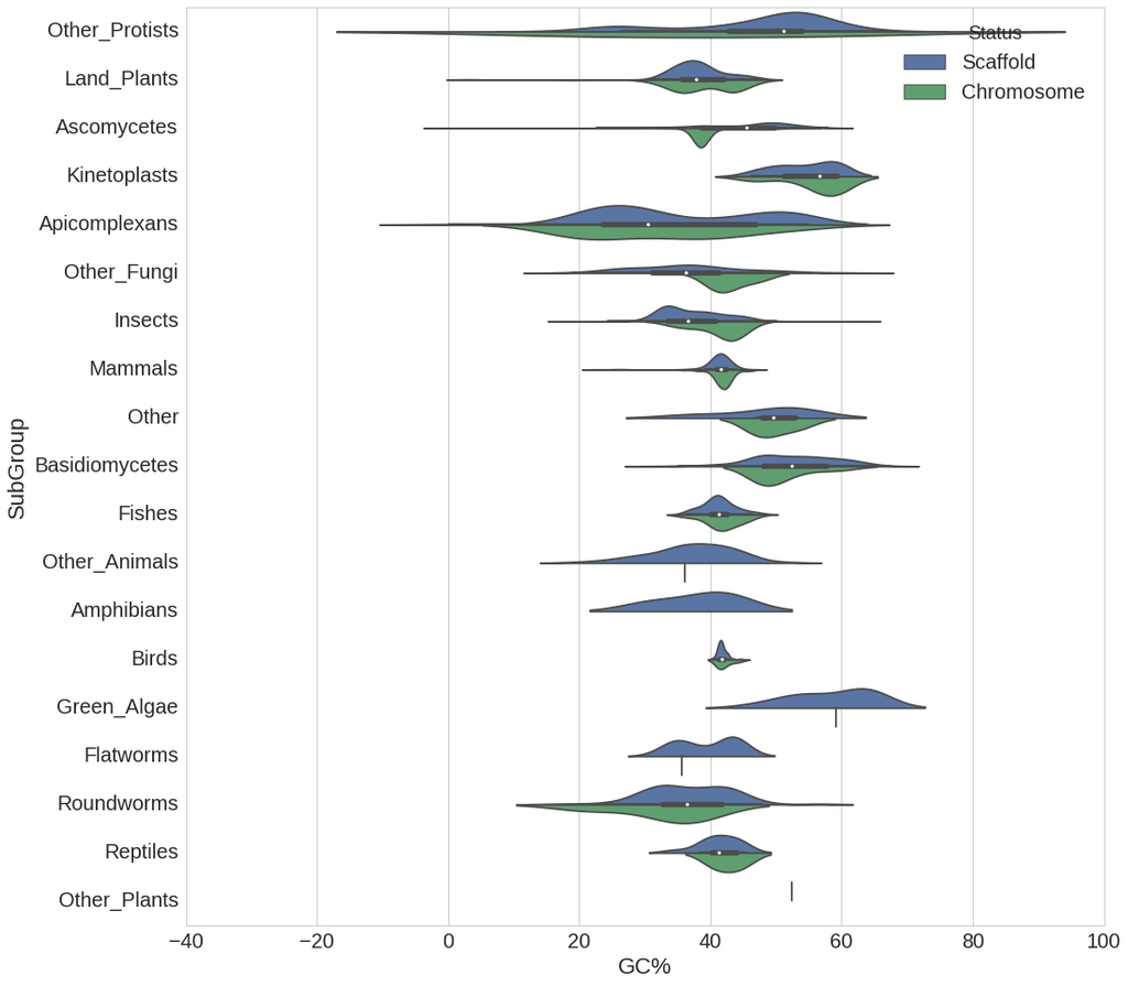
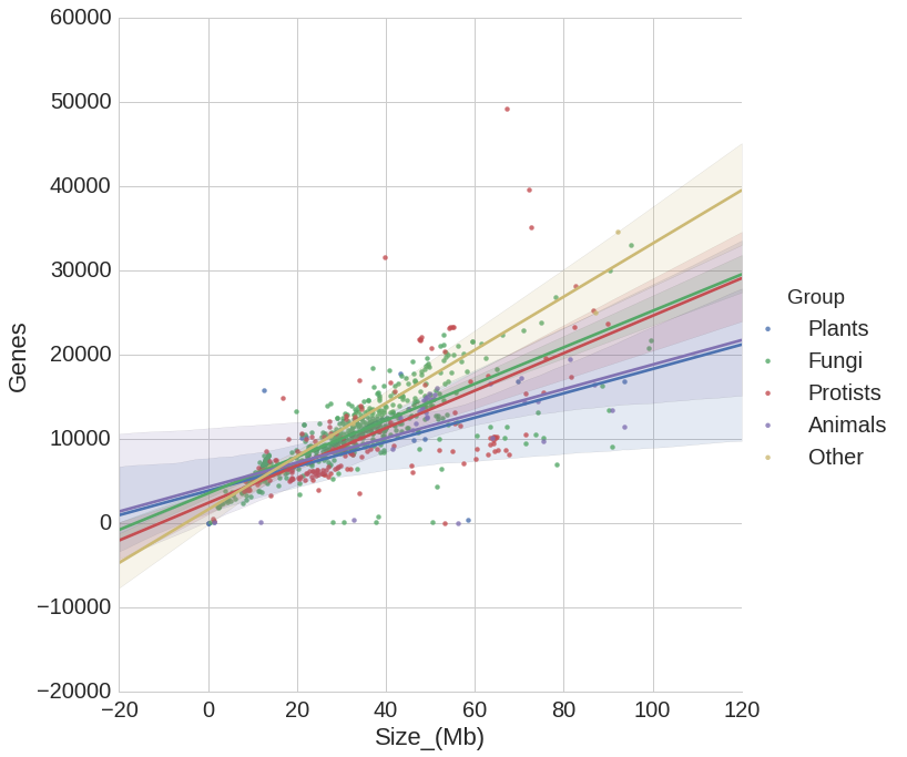
implementations of some slightly unusual charts types — I find its heatmaps, violin plots and hexbin plots are often useful when dealing with genome-scale biological data. It also has fantastic
support for what it calls "factor plots", which allow us to see how relationships differ between categories (e.g. male vs female specimens, or normal vs. diseased cells).
Another nice property of seaborn is that it works directly with pandas objects. This makes it very easy to use the two libraries together, which is why I have chosen these as the main topics for
my data visualisation course. The combination of pandas for reading/cleaning/manipulating data, and seaborn for producing charts, is a very powerful one for answering biological questions.


Are there other libraries that are also worth mentioning for very specific use cases?
People who are already very familiar with R's ggplot2 might want to look at the Python ggplot module, which implements a very similar interface. This will let you use concepts from ggplot2 and
the "Grammar of Graphics" approach to customising plots. This is a very different approach to that used by other Python charting libraries though, so eventually you will probably need to learn
another way.
If you need to create interactive plots for a web page, then take a look at bokeh and plotly — although if your goal is to make interactive online graphics, you will eventually want to switch to
a javascript solution like the renowned D3 javascript library. It's also possible to add interactivity to charts using jupyter notebooks and ipython widgets — this is an area in which I hope
we'll see more progress soon, as interactive features can make charts fantastically useful for non-programmers.
Geographical data visualisation is a task that's not currently as easy in Python as we would like. We can plot geographical data with maplotlib using the basemap toolkit; also check out
geoplotlib. I also have to mention one of my favourite Python modules folium, which is great for drawing simple interactive maps with markers and shapes.
Thanks Martin and see you in Berlin!